Attractive Poison
Karlee Iacino
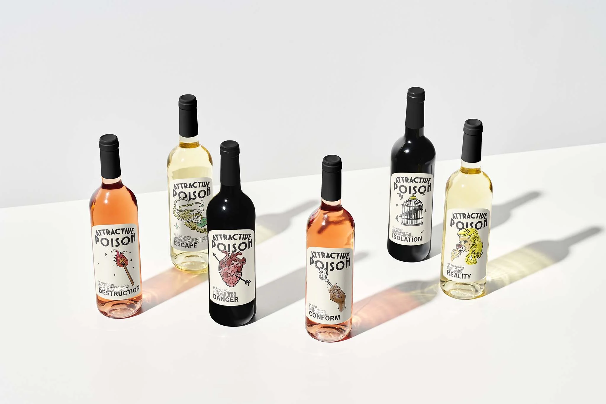
We are witnessing a cultural shift as Gen Z and Millennials are drinking significantly less, challenging the long-standing dominance of alcohol. For decades, Big Alcohol has governed our perceptions through marketing myths that equates drinking with glamour, adventure, and even health. In 2015, the industry spent over $1.4 billion on advertising,1 designed to manipulate the masses to sustain consumption. But with consumption declining, how can reframing of alcohol branding reflect this cultural shift while exposing the marketing myths?
By deconstructing these myths, this thesis uses wine labels as a tool to expose how glamour and health are not stable truths in alcohol consumption but rather riddled with contradictions. Attractive Poison draws from post-structuralist theory and inspiration from Détournement to expose binary oppositions and position the wine label as a metaphor for the cultural shift unfolding today. As an alcohol brand, Attractive Poison uses design as a critique by transforming a familiar object into a platform for questioning.
This project reveals that due to the phenomena of the decline, truth is not fixed but is constantly shaped by culture and perception.2 Ultimately, Big Alcohol manipulates narratives that are untrue, but Gen Z and Millennials can see through them. Design can be used to sell consumption; here, it becomes a tool that dismantles it.


Contact me
karleeiacinoart@gmail.com
Instagram: @Karlee-iacino