Letters and Landmarks
Tellie Fackelman
Why is identity important, not only on a personal level, but within the context of a community or place? This thesis explores that question through the lens of Denver, using typography as a method to uncover and honor the culture and identity already present in the city. Specifically, this project asks how typographic personas shape perception and how typography influences the identity of a place. Through this inquiry, it considers whether typography meaningfully contributes to a city’s overall sense of identity.
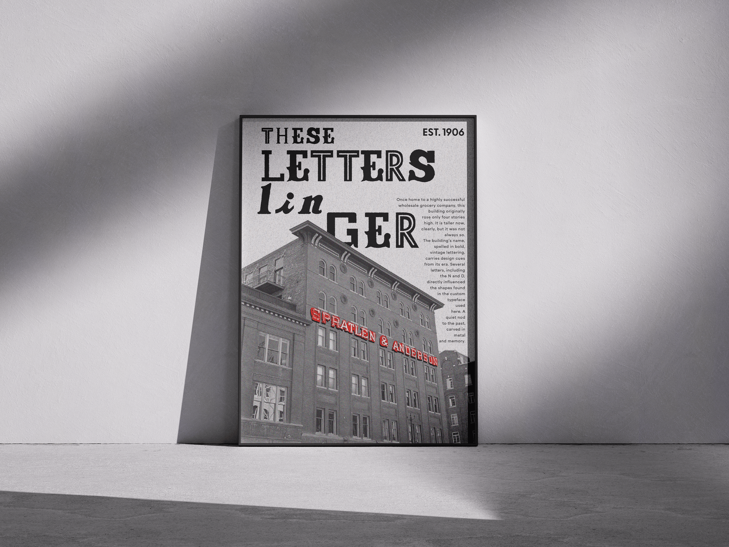
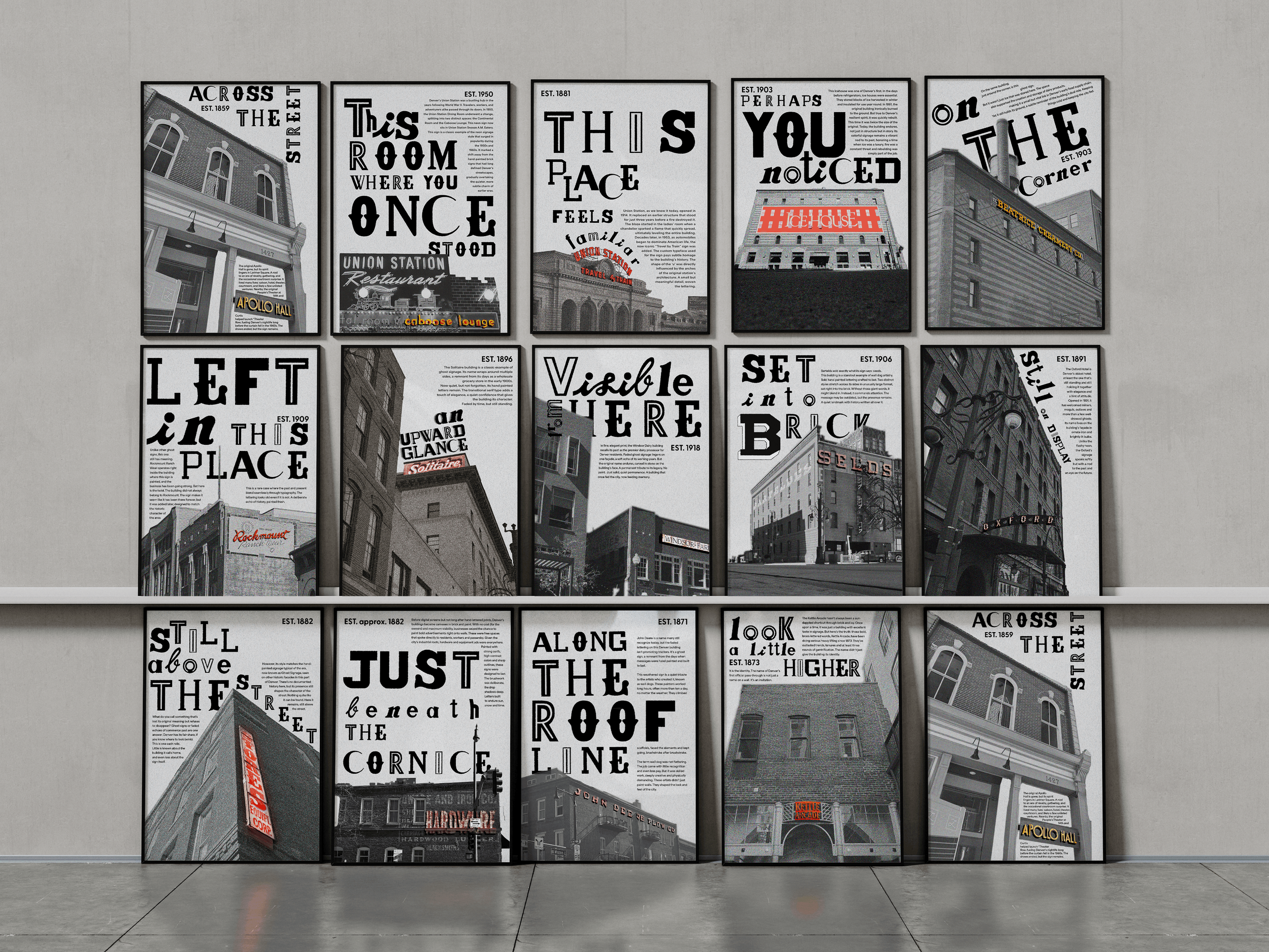
Letters and Landmarks take shape through the creation of a custom typeface built from existing typographic elements found throughout the city of Denver. By documenting signage, architectural lettering, murals, wayfinding systems, and other typographic forms, I collect visual fragments that reflect the city’s character. These elements are analyzed, abstracted, and reinterpreted into a cohesive typographic system that embodies Denver’s identity as a living persona. Each formal decision, including proportion, weight, texture, and structure, is informed by research into how typography shapes understanding and place of attachment. Influenced by typography, environmental graphic design, and place-based branding, the work positions letterforms as cultural artifacts rather than neutral tools for communication. Historical references to Western signage and contemporary urban development both inform the visual language, allowing the typeface to bridge past and present. The resulting forms carry the mood and texture of the city, translating its layered history into a unified visual voice. Through applications such as posters, identity systems, and spatial graphics, the typeface demonstrates how typography can both reflect and actively shape a city’s sense of identity.
Letters and Landmarks asserts that typography is not merely a tool for communication but a powerful contributor to the identity of a place. By constructing a typeface from the existing visual language of Denver, I intentionally ground the work in authenticity and lived experience. Each design decision reflects a commitment to honoring the city’s cultural layers while shaping a cohesive and contemporary expression of its character. Through research, documentation, and formal experimentation, the project proves that typographic form carries memory, mood, and meaning. Ultimately, this affirms that design has the capacity to both reflect and influence how a community understands itself, positioning typography as an active force in defining a city’s identity.